Liquid Glass UI
A skill for Claude Code, Codex or Cursor. Ask for a glass UI and it builds buttons, bars and menus that bend the light behind them, the way Apple's Liquid Glass does.
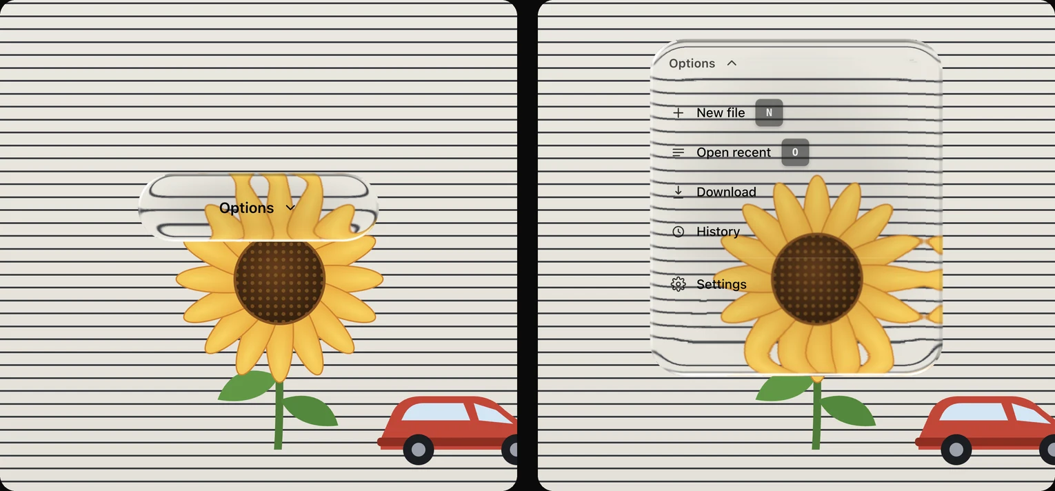
Real refraction. Whatever sits behind the glass curves into its edge, not just blurs.
Moves like glass. Controls fade in, and buttons grow into menus while the light keeps bending.
Light on the page. A whole screen of glass scrolls as smoothly as the page without it.
Install
curl -fsSL https://www.devmafex.com/glass/refractive-glass-ui.zip -o /tmp/glass-ui.zip
unzip -o /tmp/glass-ui.zip -d ~/.claude/skillsThen ask your agent to “build this with the glass UI skill”. Works best in Chrome, Edge and Arc.
The skill file (SKILL.md)ShowHide
---
name: refractive-glass-ui
description: Use when building, restyling, or reviewing any frontend (web app, website, dashboard, landing page, editor, Electron/Tauri, or native iOS/Android/Flutter app) that should look like Apple's Liquid Glass or refractive glass, or when the user asks for "glass UI", "liquid glass", "glassy", "glassmorphism", "frosted glass", glass buttons, glass toolbars, glass menus, glass tab bars, or glass pills.
---

# Liquid Glass UI

A design system for **Liquid Glass**: Apple's WWDC25 material, measured from Apple's own frames and rebuilt as a web engine. Every glass surface is a real lens:
- **Bend.** The content behind bends through the whole rim band. A straight line behind a pill becomes a bowl, a light crescent wraps down the sides, and the bend follows the element's exact outline (capsules, circles, rounded rects with slightly squarish corners).
- **Light.** A crisp lit edge follows the light: bright along the bottom and upper-left, a thin dark line on the sides facing away. A faint colour fringe sits where the bend is strongest. No CSS strokes or glows: the engine draws the light.
- **Body.** Thin. `regular` (default) is a neutral 7% body over an 8 px frost: fine detail behind it becomes smooth gradients (so nothing shimmers when content moves) while the frosted content still bends through the rim; `clear` is a bare lens with an 8% tint in the middle; `frosted` is a 14% body over a 10 px frost for menus and dialogs full of text. Never thicken the body with your own backgrounds, blurs or gradients: a milky, blurred pill is glassmorphism, not glass.
- **Motion.** Glass **materializes**: the bend and the light grow in over 600 ms instead of fading. A control can **morph**: one piece of glass grows from a button into a menu while the content keeps bending through its edge.

Everything is ready to copy: tokens, component classes, the refraction engine, behaviours, and a snapshot test (`tests/`) that locks the look. Chromium renders the lens; Safari and Firefox get a frosted tint automatically.

## Where glass lives (read this before laying anything out)

Liquid Glass is chrome that floats over content. Out of the box, an app built with this skill should look like Apple's: a few large glass controls floating over imagery, not a page of grey panels.

1. **Glass sits on detail, always.** The lens is only visible where something behind it has edges: text, lines, a grid, a photo, a map, list rows. Over a flat colour, a soft gradient or a single blurry blob nothing bends, and the result is ordinary glassmorphism, which is a failure. Rule: every glass element must overlap high-contrast detail across most of its area. If a section has none, put a detailed layer behind it first: large type (`.gl-scene--type` + an `h1` at 96–160 px), ruled lines (`.gl-scene--lines`, `--lines-light`), a grid (`--grid`), dots (`--dots`), stripes (`--stripes`), a hard horizon (`--horizon`), a sunset (`--sunset`), or an inline-SVG scene with sharp shapes (a sun, a flower, a car, a skyline). Fine, hard-edged detail beats big soft shapes.
2. **Big, few, capsule.** The corner radius also sets how thick the glass looks: the bend depth follows the smaller of the short side and 4 × the radius, so capsules bend through their whole rim and panels with 18–32 px corners bend only at the edge. Don't give a large panel a tiny radius and expect a strong bend, and don't override `pull`/`bezelWidth` by hand: past the corners the bend draws seams. Bars are 56–72 px tall, buttons at least 44 px, pills at least 200 px wide; group controls into one capsule instead of scattering small ones. Liquid controls (`pill`, `button`, `dock`, `toolbar`, `heavy`) default to a capsule (radius = half the short side); menus, panels, rails and widgets keep their tier radius (12–32 px) so rows are never clipped. Override with `data-glass-radius="<px>"` or `"capsule"`; keep nested shapes concentric.
3. **Chrome floats, content scrolls.** Toolbars, tab bars, docks and floating buttons are `position: fixed|sticky` over scrolling content, so the bend animates as the user scrolls.
4. **One layer.** Rows, buttons and inputs inside glass are washes and strokes, never more glass. Nested glass cannot refract through its parent.
5. **Text on glass.** White over photos and dark content. Over light content add `gl-glass--ink` (dark labels). For anything text-heavy (menus, dialogs, sheets) use `frosted`. Never put body copy on `clear`.
6. **Budget.** Small controls are one filter pass each and cost nothing measurable, so use as many as the design needs; keep hero-sized lenses (side ≥ 400 px) to one or two per view and use `frosted` for sheets and dialogs. Maps are built in a worker (no main-thread stalls), elements start when they approach the viewport and pause when far offscreen.
7. **Materials by role.** `clear` for media controls, hero elements and any control shown over imagery or patterns; `regular` for bars, tabs, pills, cards, widgets; `frosted` only for menus, dialogs and popovers with several lines of text; `smoked` only when the brief asks for dark pro-tool chrome.
8. **The showcase test.** Before you finish, look at one glass element at 2×: a straight line or letter behind it must visibly curve into the rim, a crisp bright line must sit on the lit edge, and the body must be almost as transparent as the reference pill in `assets/liquid.html`. If not, the backdrop lacks detail or the element is too small (make it ≥ 56 px tall).

## Pick the path

| Target project | Use |
|---|---|
| HTML, Vue, Svelte, Astro, Angular, Solid, Electron | Copy `assets/glass.css`, `assets/refractive.js` and `assets/controls.js`. Put `class="gl-root"` on `<body>`, `data-glass="<tier>"` on glass elements (optional `data-glass-material="clear|regular|frosted|smoked"`, `data-glass-radius`, `data-glass-materialize`), then call `autoRefract()` after the DOM is ready. Use `bindSlider(el)`, `bindMenu(trigger, menu)` and `bindMorph(el)` from `controls.js`. |
| React / Next.js | Copy `assets/glass.css`. For liquid glass call `refract(el, { ...MATERIALS.regular, radius: "capsule" })` from `assets/refractive.js` in a `useEffect` and return its cleanup. `assets/react/glass.tsx` (on `@hashintel/refractive`) covers the smoked chrome components only. |
| React + Tailwind (utility classes instead of `glass.css`) | `references/recipes.md` |
| Native (SwiftUI, Flutter, React Native) | Same tokens; the backdrop mapping is in `references/engine.md` → "Other platforms" |

Visual references, served from the assets folder (`python3 -m http.server`) in a Chromium browser: `assets/motion.html` (a photo feed scrolling under a glass toolbar and tab bar, a drifting clear pill, press pulses, a frosted dropdown and a morphing menu — the reference for how glass should look and feel in motion), `assets/liquid.html` (one clear button that morphs into a menu over a ruled sheet and a sunflower, with a Clear/Regular/Frosted switch) and `assets/demo.html` (an OS-style widget desktop in smoked chrome, with clear media controls).

## Surface map: copy this markup

`data-glass` picks the tier (radius for smoked; a size hint otherwise). The engine forces `border-radius` and a matching `clip-path`, so **don't set radii yourself**. Liquid elements take **no** `gl-rim`, `gl-glow`, `gl-drop` or `gl-hairline` classes.

| Component | Element classes and attributes | Notes |
|---|---|---|
| Hero pill (Apple's demo) | `gl-glass gl-glass--clear` `data-glass="widget" data-glass-material="clear" data-glass-materialize` on a 589×345 box over a two-tone or photo backdrop | the reference look; scales to any size |
| Nav bar / floating toolbar | `gl-glass gl-toolbar` `data-glass="toolbar"` › `gl-tool` (icon 18), `gl-tool gl-tool--more`, `gl-vdivider`, `gl-tool gl-tool--toggle` | regular by default |
| Tab bar / action dock | `gl-glass gl-dock` `data-glass="dock"` › `gl-dock-item` (`--icon`, `--glyph` with `<span class="gl-glyph">+</span>`), `gl-dock-more` (`<i></i>`×3) | one capsule for all tabs; `aria-pressed` marks the active tab |
| Back / title / icon pills | `gl-glass gl-pill gl-pill--back` › `<button>{icon 18}Back</button>`, `gl-pill--title`, `gl-pill--icon`; `data-glass="pill"` | |
| Media controls | round `gl-glass gl-glass--clear` buttons (44–96 px) and a `gl-glass gl-glass--clear` pill; `data-glass="widget" data-glass-material="clear" data-glass-materialize` | over photos add `gl-glass--regular` on the buttons for Apple's white lift |
| Floating action button | `gl-glass gl-float-btn` `data-glass="button"` | |
| Counter / stepper pill | `gl-glass gl-counter` › `gl-counter-inner` › `gl-counter-label` (`Step 3 <span class="gl-counter-total">/ 12</span>`) + chevron; `data-glass="button"` | |
| Morphing menu | `gl-morph gl-glass gl-glass--clear` (or no `--clear` for regular) `data-glass="menu" data-glass-radius="40" data-glass-material="clear"` › `button.gl-morph-face` (label + chevron) + `ul.gl-morph-menu[role=menu]` › `li › button[role=menuitem]`, `li.gl-hdivider`; sizes via `--gl-morph-w/-h/-open-w/-open-h`; `bindMorph(el)` | the button IS the menu; the lens re-renders live while it grows |
| Compact menu | `gl-glass gl-glass--frosted gl-menu` `data-glass="menu" data-glass-material="frosted"` › `gl-menu-label`, `gl-row` (`{icon}<span>Label</span>`) | `bindMenu(trigger, menu)` |
| "More" menu | `gl-glass gl-glass--frosted gl-menu gl-menu--wide` `data-glass="menuWide" data-glass-material="frosted"` › `gl-row gl-row--pill`, `gl-hdivider` | |
| Menu from a floating toolbar | `gl-glass gl-glass--frosted gl-menu gl-menu--overlay` `data-glass="overlayMenu" data-glass-material="frosted"` › `gl-row` (+ check svg when `aria-selected`) | |
| Side rail / sidebar | `gl-glass gl-rail` `data-glass="rail" data-glass-radius="24"` › `gl-rail-scroll` › `gl-thumb` / `gl-thumb gl-thumb--active` › `gl-thumb-ring` › `gl-thumb-media` | over a wallpaper or the content it scrolls |
| Popover / picker / sheet | `gl-glass gl-glass--frosted` + your padding; `data-glass="panel" data-glass-material="frosted" data-glass-radius="28"` | |
| Dialog | `gl-glass gl-glass--frosted gl-dialog` `data-glass="button" data-glass-material="frosted" data-glass-radius="28"` › `gl-dialog-head` (`gl-dialog-title`, `gl-dialog-desc`), `gl-group` › `gl-group-row` | |
| Announcement modal | `gl-overlay` + `gl-modal` › `gl-modal-body` › `gl-modal-stack` (`gl-badge gl-hairline`, `gl-modal-copy` › `gl-modal-title`, `gl-modal-text`) + `gl-modal-actions` (`gl-btn gl-btn--secondary`, `gl-btn gl-btn--primary`) | CSS-only |
| Widgets (weather, now playing, control centre, calendar, notification, spotlight, app dock) | `gl-glass gl-widget` `data-glass="widget" data-glass-radius="28"` › the same inner classes as the smoked table below (`gl-weather-*`, `gl-player`, `gl-cc`, `gl-cal`, `gl-notif-*`, `gl-spotlight`, `gl-appdock` › `gl-app`) | over a bright wallpaper |
| Segmented / tabs | `gl-segmented gl-rim` › `gl-segment` (`aria-selected`) | CSS-only control |
| Search field | `gl-search gl-rim` › svg + `<input>` (+ `gl-keys` › `kbd.gl-kbd.gl-rim`) | CSS-only |
| Slider | `gl-slider` (`--gl-value: 62%`) › `gl-slider-bubble`, `gl-slider-track` › `gl-slider-fill`, `gl-slider-thumb`; `bindSlider(el)` | CSS-only |
| Switch | `gl-switch` (`aria-checked`); add `gl-rim` for the off state | CSS-only |
| Chips | `gl-chips` › `button.gl-chip.gl-hairline` (`aria-pressed`) | CSS-only |
| Glass card (static) | `gl-card gl-rim` › `gl-card-title`, `gl-card-sub`, `ul.gl-card-list` › `li.gl-tile` › `p.gl-tile-text` | CSS-only |
| Buttons | `gl-btn gl-btn--primary\|secondary\|outline\|glass\|panel\|sm`; header primary action `gl-btn-bevel` | CSS-only |
| Swatches | `gl-swatches` › `gl-swatch` | CSS-only |

### Smoked chrome (legacy, opt-in)
Dark pro-tool chrome: charcoal fills, a 1 px rim or hairline, an inner glow, bezel-only refraction. Every recipe needs `gl-glass--smoked` and `data-glass-material="smoked"` in addition to the classes below; fills `gl-glass--70|--50|--deep|--frost|--lift|--dialog` and strokes `gl-rim`, `gl-hairline` (+ `--bright`), light `gl-glow`, `gl-drop` are smoked-only.

| Component | Element classes | Tier |
|---|---|---|
| Back / title / icon pill | `gl-glass gl-glass--smoked gl-glass--70 gl-rim gl-glow gl-pill gl-pill--back` (title/icon: `gl-glass--50`) | `pill` |
| Bottom dock | `gl-glass gl-glass--smoked gl-rim gl-glow gl-drop gl-dock` › `gl-dock-item` | `dock` |
| Counter button | `gl-glass gl-glass--smoked gl-rim gl-glow gl-drop gl-counter` | `button` |
| Secondary float button | `gl-glass gl-glass--smoked gl-glass--lift gl-rim gl-float-btn` | `button` |
| Element toolbar | `gl-glass gl-glass--smoked gl-hairline gl-toolbar` | `toolbar` |
| Menus | compact `gl-glass gl-glass--smoked gl-glass--deep gl-menu`; wide `… gl-hairline gl-menu gl-menu--wide`; overlay `… gl-glass--deep gl-hairline gl-menu gl-menu--overlay` | `menu` / `menuWide` / `overlayMenu` |
| Side rail | `gl-glass gl-glass--smoked gl-glass--50 gl-rail` | `rail` |
| Popover | `gl-glass gl-glass--smoked gl-hairline` | `panel` |
| Frosted toolbar | `gl-glass gl-glass--smoked gl-glass--frost gl-hairline gl-hairline--bright gl-toolbar` | `heavy` |
| Dialog | `gl-glass gl-glass--smoked gl-glass--dialog gl-rim gl-dialog` | `button` |
| Widgets | `gl-glass gl-glass--smoked gl-glass--50 gl-rim gl-glow gl-widget` (+ `gl-drop` on the app dock) | `widget` |

State attributes the CSS reads: `aria-expanded="true"` (open trigger), `aria-pressed="true"` (mode on / active tab), `aria-selected="true"` (row, segment, swatch), `data-highlighted` (keyboard row), `aria-disabled`, `aria-checked`, `data-state="closed"` (menu exit).

Content on glass:
- **Type:** the system stack (`--gl-font`: SF Pro, then Inter, Segoe, Roboto); the kit ships no web font. Labels 14px/600, rows 14px/500, white by default.
- **Icons:** 18 px in toolbars, 20 px in rows and docks. Resting row icons are `#898989`, white on hover.
- **State:** white washes. `white/10` for hover, `#FFFFFF29` for selected or active.
- **Actions:** a dialog's primary action is a solid white pill (`gl-btn--primary`); the teal accent (`--gl-accent`) is for badges, progress and focus only.

## Wiring rules
- **`autoRefract()`** wires every `[data-glass]`: material from `data-glass-material` (default `regular`), radius from `data-glass-radius` (default capsule for liquid controls, the tier radius for menus, panels, widgets and smoked), `data-glass-materialize[="ms"]` to animate in, `data-glass-eager` to build immediately instead of on approach. It returns a cleanup. `glassConfig({ worker: false })` builds maps inline (tests, environments without Workers). For elements that mount later, call `refract(el, { ...MATERIALS.frosted, radius: 28 })` on mount and the returned `stop()` on unmount.
- **Live shapes.** Animate `width`/`height` with CSS transitions (as `.gl-morph` does). While the size changes the engine rebuilds only the bend map, inline and cheap, and keeps the rim light crisp with a 9-slice image; the exact full-quality build lands when it settles. Two rules for anything that animates its size: give it a **fixed `data-glass-radius`** (a capsule's radius changes with its height, so its corners would squeeze mid-animation), and **never animate `transform: scale()`** on glass (the lens would scale with it).
- **Nothing between the glass and the page.** `backdrop-filter` only sees what is painted behind the element inside its stacking context. A wrapper with `z-index`, `position: sticky`, `transform`, `filter` or `opacity < 1` isolates the glass from the page and it renders as a solid capsule. Put `position: fixed|sticky` and `z-index` on the glass element itself, keep wrappers plain, and give dialogs their own fixed layer separate from the dimmed backdrop. The engine adds a `::after` light overlay to liquid elements, so do not use `::after` on them yourself.
- **`stop.set({ intensity })`** (0–1) scales bend, fringe and light together: pulse to 0.7 on press, back to 1 on release. `stop.materialize(ms)` replays the appear animation.
- **Menus from a UI kit** (Radix, Headless UI, Ark, Floating UI): strip the kit's content element to `background: transparent; border: 0; padding: 0; box-shadow: none`, render the glass panel inside it, and `refract()` it on mount.
- **Menus that stay mounted:** `autoRefract()` once, then `bindMenu()` / `openMenu()` / `closeMenu()` from `controls.js`. They toggle the `hidden` attribute; `glass.css` makes `[hidden]` win over component `display` rules.
- **Readability over effect.** `frosted` for text-heavy surfaces; `gl-glass--solid` when the content behind is text the user must read at the same time.
- **Mix-blend strokes on your own CSS-only glass** go on a sibling element, because `backdrop-filter`, transforms and z-index trap blending.
- **Motion:** liquid elements materialize (600 ms); menus and modals run `gl-pop-in` (150 ms) and exit in 100 ms; everything else transitions over 150 ms. Reduced motion and reduced transparency are handled by the CSS.

## Done means
- Open the page in Chromium: every liquid element visibly bends what is behind it at its edge, has a lit edge (no CSS outline), and appeared with the materialize animation. Compare with `assets/liquid.html`.
- No glass sits on a flat colour. No glass is nested in glass. No `gl-rim`/`gl-glow`/`gl-hairline` on liquid elements.
- Safari or Firefox shows the same layout with frosted-tint glass.
- If anything animates its size, open and close it in Chromium: the rim line must stay crisp and complete (including the bottom edge) through the whole animation. Compare with `assets/motion.html`.
- Every interactive element has a hover wash, a keyboard focus ring (`0 0 0 2px rgba(255,255,255,.5)`), and a visible selected state.
- **After editing this skill:** run `python3 tests/compare.py` (needs Chrome and Pillow). It must print PASS. Use `--update` only for an intentional visual change.

## Reference files
- `references/engine.md`: how the lens works (shape maps, bend profile, lit edge, precision), every parameter, browser support, performance, native platforms.
- `references/recipes.md`: Tailwind/JSX versions of the components, plus a z-index ladder.
- `references/fidelity.md`: what the snapshot test covers and the design details it locks in.
- `assets/glass.css`: all tokens (`--gl-*`) and component classes. It is the single source of values.